

I Am Construction Campaign Posters
Humanizing the trades through authentic worker stories

Overview
My Role
Graphic Designer at Trio Group, working under the guidance and mentorship of the Creative Director.
The Challenge
The I Am Construction campaign set out to highlight authentic worker stories and inspire people to consider careers in the trades. Earlier poster layouts, created before I joined the project, often distracted from the individuals being featured. Heavy backgrounds, inconsistent type, and cluttered layouts made it harder for the person’s story to stand out. I was brought in to create a new system that would center each worker, build consistency across the campaign, and scale as new stories were added.

My Process
Exploration and Early Versions
I began by exploring multiple layout and type directions, producing several variations for each subject. These explorations tested how quotes, names, and headlines could be arranged and helped define what created clutter versus what allowed the worker’s story to take center stage. From these early versions, the Creative Director selected the strongest direction to refine further.
Creative Director Selection
From the initial set of explorations, the Creative Director selected two layouts that best supported the goals of the campaign. I then created color variations for both designs, which allowed us to compare how the system might scale and adapt across different subjects. This stage was essential for testing flexibility before moving into refinement.
Refinement and Cohesion
As I iterated, I locked in a clear hierarchy: headline at the top, quote as the centerpiece, name and title consistently structured, and a unified footer system. Feedback guided me to reduce repetitive photography, integrate branding more consistently, and make adjustments that ensured trade-accurate representation such as correct safety equipment and more diverse images.
Final System
The result was a scalable template where every poster feels part of the same family. The portraits and quotes are now the clear focal point, supported by clean typography and cohesive branding. Each piece is digestible in just a few seconds, which is essential for high-traffic environments like schools, job fairs, and worksites.
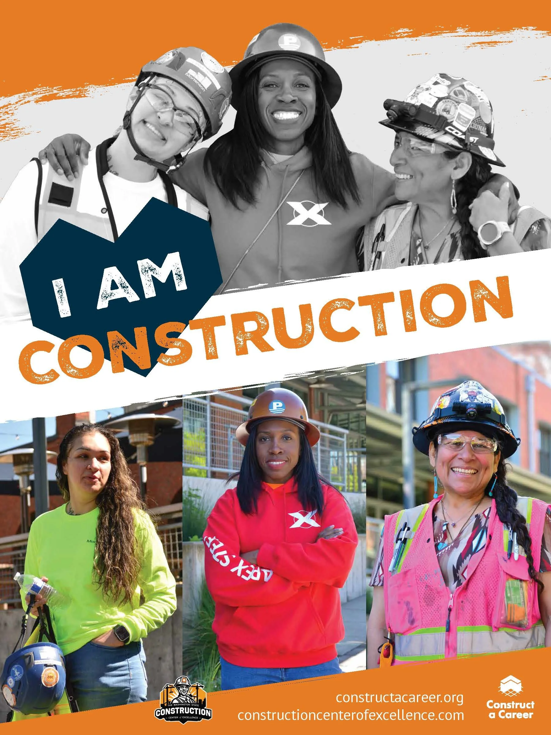
In addition to the 18 individual hero posters, I also created group posters under the same system, which reinforced the campaign’s message of collective pride and unity in the trades.
Why It Works
Accessibility: Clear hierarchy makes each story legible at a glance.
Authenticity: Imagery reflects trades accurately and builds trust with audiences.
Cohesion: Consistent design unifies all 18 hero posters and 3 group posters.
Scalability: The system adapts easily to new quotes and photos as the campaign expands.
Outcomes
The redesigned campaign shifted the focus to the workers themselves. With a polished, unified system in place, the I Am Construction series now serves as a professional, human-centered recruitment tool actively used across Washington State.
What I Learned
Working on this campaign taught me the importance of designing for consistency at scale. It was not just about making one poster look good but about creating a system that could carry 18 different individual stories while still feeling unified. I also learned how critical it is to balance authenticity and accessibility. The design had to respect each worker’s trade while staying legible in high-traffic environments. Finally, I grew more confident in iterating through feedback and adapting my designs without losing the integrity of the system.